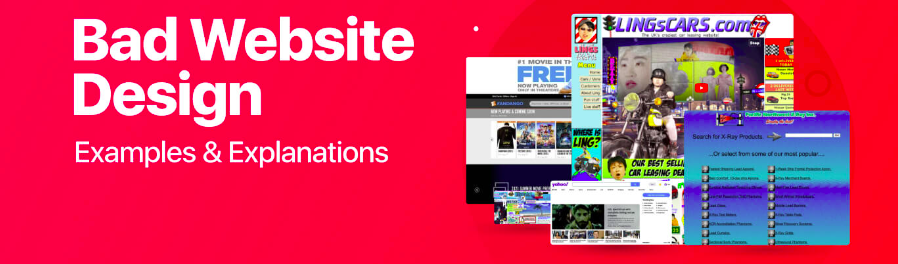
What Is Bad Website Design?
A number of elements contribute to bad website design, which in turn compromises a user experience and is ineffective. Bad website design has no basis for considering needs and expectations of the users to be important. This may come in different forms such as cluttered layouts that bombard clients with too much information, slow loadings that continuously test people’s tolerance, and poor navigations that make them feel lost or angry. The last but not the least; old-fashioned graphic design aspects, inconsistent branding, advertisement distraction add up to an unpleasant user experience which also affects credibility of such platforms as mentioned above. Eventually, terrible web design will have no common ground between what customers want from the site themselves those goals required by its owners thus missing out on occasions for interaction conversion retention.
Bad website design goes beyond appearances and functionality and includes accessibility concerns. Websites that exclude individuals with disabilities because they lack accessible features like alt text for images, keyboard navigation or proper color contrast are useless. With this regard inclusivity is not just about leaving out many potential users but also violates principles of ethics regarding equal access as well as fairness within a society. Bad website design therefore denotes lack of prioritizing user need accessibility or usability in a way that weakens user experience in terms of its function and makes it incapable of achieving the purpose targeted at through missed opportunities.
This blog post will look at some symptoms that may indicate that you need to redo your website. Signs of bad website design are:
1. Cluttered Layout:
A cluttered layout is one of the biggest indicators of bad web design. When visitors come to a page and it is already filled with jumbled text, images and pop-ups vying for their attention, it creates an uneasy dizzying experience. Users cannot easily find what they want on screen with such a confusingly piled-up layout; hence this leads to frustration before being abandoned completely.
2. Slow Loading Times:
Nowadays in our fast-paced digital environment everyone expects a website to load within seconds. One major problem with design if it takes too long is when your site takes ages to open. Slow loading speeds can be caused by large images, bloated code or lack of optimization among other reasons and this keeps users from seeing what your site is all about.
3. Poor Navigation:
Navigation is central to any website; how users go from one page to another and find content of interest to them all depends on navigation. Navigating through a badly designed site gives users a sense of being lost as well as frustrated common indications for bad navigation include ambiguous menus, broken links, and unsteady page designs. A lack of clarity in terms of navigating means that instead people will look for sites which are easier going around thus deserting yours.
4. Unresponsive Design:
The proliferation of smartphones and tablets necessitates that websites should be mobile optimized. A poorly done website is one where you have not adjusted it to different device screens as well as sizes. Users should not have to pinch and zoom to read or click on content that is too small. Responsive design ensures that your site looks great and works seamlessly on every device hence enhancing user experience.
5. Lack of Accessibility:
When designing websites, people usually forget about accessibility but it is very important because it enables everyone regardless of disability to use your website. A good proportion of possible users will be left behind if there are no accessibility features like alt text for images, proper color contrast, keyboard navigation etc. By making the site more accessible you improve user experience for all as well as reflect commitment to inclusivity.
6. Distracting Ads and Pop-ups:
Though ads and pop ups can be a revenue source for website owners, they can take away from the overall user experience when overused or badly implemented. For instance, a site that subjects users to countless ads and pop-ups that interferes with their browsing experience rather than concentrating on its content. Mostly, instead of improving the user’s interaction with the page at hand these distractions turn them away from your site further undermining its credibility.
7. Outdated Visual Design:
Visual design is very important in attracting visitors’ attention and showing the brand. An outdated visual design on a website, filled with unprofessional pictures of stock images, badly mixed colors and unattractive graphics reflects a low level of its professionalism. Users are demanding for modern and visually appealing websites that embrace current designing fads in today’s visually-driven digital sphere. A non-evolving visual design will result into a dull looking site that would shut off potential users who then seek to go to more interactive sites.
8. Lack of Clear Call-to-Action (CTA):
Every website has specific goals such as making sales, capturing leads or encouraging users to sign up for the newsletter among others. Without clear calls-to-action (CTAs), users cannot be directed towards achieving these goals. Websites that have ambiguous or hidden CTAs make user actions difficult resulting in missed conversion opportunities. Good CTAs must be readily visible, distinct enough to attract eye attention and should let users know what it is they should do next exactly. This way, users can leave your site without clicking any item or using any service on it.
9. Inconsistent Branding:
Having a consistent brand identity across all touchpoints including your website is crucial. Credibility and professionalism of the website are undermined by inconsistent branding such as fonts that clash each other, mixed colors among other things such as imagery mismatched with other elements found on the page itself, which tend to confuse some people who may even start distrusting it if they note some inconsistencies between various pages or parts of the same online resource. Trust gets established with visitors through maintaining one brand throughout this portal while their recognition of this particular marketing tool gets enhanced at the same time; thus, creating an ideal atmosphere for mutual cooperation between sellers and consumers respectively. Consistency in branding not only improves user experience but also adds value to how customers perceive a brand.
10. Lack of User Feedback and Testing:
User feedback and testing are crucial to any successful web design process. Such a website is bound to be plagued by unnoticed design flaws because it lacks user input or the designers have not tested it for usability issues. The absence of user feedback and testing also makes it difficult to figure out a need for improvement, resulting in poor user experience. Regularly involving users and carrying out usability tests pinpoints areas that need attention, thus improving the websites’ general performance. Through prioritizing user feedback and testing, you can make your website really correspond with what users expect from it.
What A Good Website Design Looks Like In 2024
Fast-forward to 2024, effective website design is about seamlessly harmonizing aesthetics, functionality and user-centeredness. The rise of smartphones and tablets in web browsing habits has therefore led to these sites being more mobile-centric. Moreover, good website design in 2024 focuses on speed and performance optimization through simple layouts as well as efficient coding that minimizes loading times. Websites also achieve this by prioritizing quick loadings that enable users to find content easily with minimal disruptions hence reducing bounce rates. Infinix Designs have professional website designers which will help improve your bad website design layout and everything into good appealing and user centric design.
Moreover, great website design in twenty twenty-four incorporates modern technologies as well as design trends which help create captivating experiences for the visitors. Websites use innovative techniques such as augmented reality (AR) elements among others like interactive animations and scroll-triggered effects to engage viewers better while at the same time passing on their message clearly. In addition, good website design prioritizes accessibility and inclusivity; hence its features include descriptive alt text.” The navigation is done using keyboard,” “high color contrast” (which assist all irrespective of impairments) etc., among other things users have disabilities can access or interact with them without difficulty,
Overall, a great website design in 2024 combines form function and inclusiveness to enable effective digital experiences that resonate with users are driven by business goals effectively.
Best Practices to Transform of Bad Website Design into Good
In the internet, which is constantly growing, a good website design is crucial as it constitutes a foundation for success. But not every site comes out winning right from the beginning; many are lapped into poor website design. The good news however, is that bad website design can be turned around and made great with proper approach. This guide will show you how to make bad website designs better and turn them into excellent ones by using practical examples and tips.
Evaluating the Current State
Before embarking on a redesign journey, it is important to identify areas where your website is lacking. In many cases, this could mean doing thorough reviews of your site’s layout, navigation menus, visual design or functionality of the website. Some common signs include chaotic layouts that have slow load times, brand inconsistency and un-usability. User feedback plus other sources each has its own unique way of pointing out friction and dissatisfaction spots respectively. Through understanding what shortcomings your current website has you can create a roadmap on how to improve it effectively.
Incorporating Best Practice
1. Streamlined Layouts: Simplify your web page’s layout by eliminating unnecessary information so as to make it easier for users to read all texts displayed in the web page. More whitespace should be provided between elements while ensuring that most significant contents are given much prominence over others.
Example: For example, Apple’s minimalist designed company uses clean layouts together with clear typography aimed at emphasizing effective product features presentation.
2. Optimized Performance: Boost image optimization speeds and minimize HTTP requests along with cache logics to enhance loading speeds for faster access across multiple devices without any delays.
Example: This includes Google search engine interface load almost instantly meaning it concentrates more on speed hence making sure queries are answered quickly.
3. Clear Navigation: Keep navigation menus simple and help users to find what they want. To make the browsing experience more pleasant, use descriptive narratives and logical transitions.
Example: Airbnb’s site has easy categorization of listings by location and type in its navigation hence enabling users to effortlessly identify and book lodgings.
4. Modern Visual Design: Update your visual design with contemporary aesthetics that match your brand’s identity. Use attractive images, consistent color choices and a uniform font style throughout the whole website.
Example: That is Squarespace which incorporates sleek designs and modern imagery on their pages, while maintaining clean layouts to illustrate creative expression as part of their brand.
5. Mobile Optimization: Make your site fully responsive for all mobile devices; mobile friendliness should be a priority due to the number of people who access the internet through smartphones or tablet computers which is ever growing.
Example: For instance, New York Times’ website adjusts perfectly on different screens thereby providing readers with consistent readings across various devices without losing its functionality.
6. Invite User Feedback: Invite user feedback about their experiences or places where they encountered problems. There are examples such as user testing sessions, surveys and analytics tools which can give insights on customer behavior as well as preferences when incorporated into this kind of research. Use this feedback to prioritize changes in order to address most important issues for users during redesigning process.
Example: For example, customers’ reviews come handy when Amazon does redesigns or add new features because it helps them understand customer needs better than any other company.
7. Accessibility Enhancements: This means that you should prioritize accessibility by making your website comply with web accessibility standards such as WCAG (Web Content Accessibility Guidelines). Such features include, but are not limited to, alternative text for images, keyboard navigations and adjustable text sizes to cater for the interests of disabled users.
Example: The BBC News website is designed to be accessed by people with visual impairment or motor disabilities by adjusting font sizes and using high contrast themes, in addition to providing an option for moving around the page using a keyboard.
8. Content Optimization: Review and optimize your website’s content to ensure that it is concise, clear and interesting. Catchy titles, descriptive meta tags and multimedia contents can help draw users’ attention while conveying information effectively.
Example: TED’s website has attractive headlines, brief descriptions, engaging videos that are inspiring and informative.
9. Continuous Iteration: Website design is never done; therefore, it’s important to keep updating and refining as per feedback from users, analytics data on interactions with your site as well as emerging trends in design. Keep up with what happens in the industry so that you don’t get out of step or lose sight of user expectations when designing the site.
Example: Spotify keeps improving its app interface through adding new features based on user feedback and usage data while at the same time enhancing usability thereby making overall music playback experience better.
By applying these approaches along with other best practices one can improve bad website design which will eventually become a highly efficient digital platform which is easy-to-use yet eye-catching. Remember, however, that good web design doesn’t stand still forever but changes over time based on keen observation of users’ reaction towards it followed by an experiment until it meets their changing needs.
Conclusion
In order to attract as well as keep visitors, good website design is an absolute must in the competitive landscape of the internet. Understanding these signs will help you identify where your site needs fixing so that it can offer seamless and enjoyable experiences to its users. Each sign from bloated layouts to slow load time warns you about whether your web page needs re-designing or something else needs doing. By focusing on usability, accessibility and user experience, one can develop an attractive website that delights and engages visitors at every step they take. To convert bad website design into excellent ones requires careful planning, execution and continuous improvement.